
Penn State’s calling it an “identity refresh.” Critics are calling it a train wreck.
Inside Higher Ed reports:
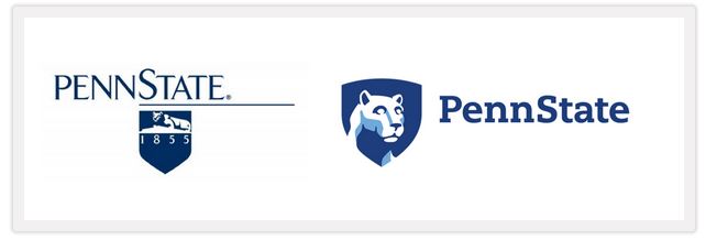
On Twitter, many said that the new logo’s lion appeared to be a zombie or the mascot for a financial institution. Other choice comments included, “The new Penn State logo would be perfect if Penn State was a pre-K,” “new Penn State Nittany lion logo looks like that hypnotized dog looking at cupcakes,” and “The lion in Penn State’s new academic logo looks like it’s just rolled around in a bunch of catnip.”
Penn State, however, has a different take.
“The refreshed version provides an opportunity to increase the visibility of Penn State while evolving the tradition of the Lion Shrine that Penn Staters hold dear,” Lawrence Lokman, vice president for strategic communications, stated in a news release. “We have a strong and vibrant university, and a bold and contemporary visual identity system is an investment that will support the University’s reputational, recruitment and resource development efforts.”
Uh huh. What’s missing is the cost to taxpayers for this reboot. Usually campaigns like this run tens of thousands of dollars. Publicly funded universities should employ the old expression: If it ain’t broke – don’t fix it.
Like The College Fix on Facebook / Follow us on Twitter
IMAGE: Penn State screenshot


Please join the conversation about our stories on Facebook, Twitter, Instagram, Reddit, MeWe, Rumble, Gab, Minds and Gettr.